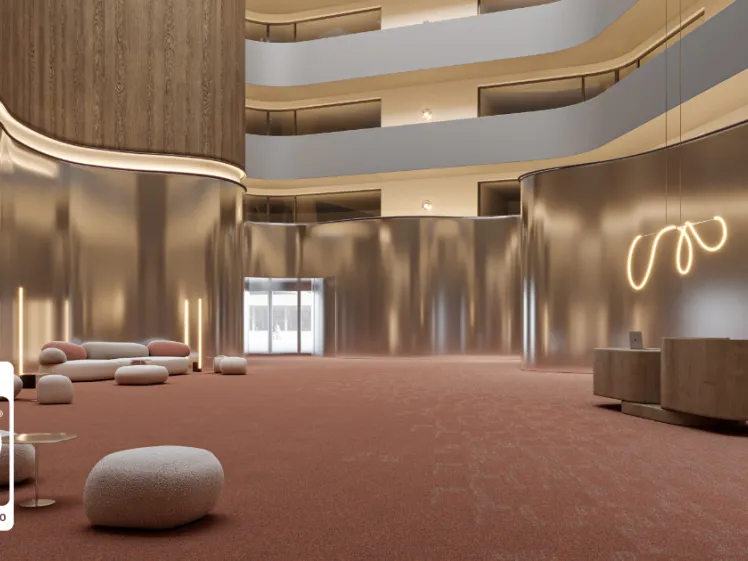
Choosing the right colour for your spatial design should not be taken lightly. The impact of colour on the atmosphere you want to create and the occupants of the space, is much bigger than you’d think. That’s where colour psychology comes in.
Colour psychology or applied colour psychology researches how colour choices can bring out certain emotional and behavioural responses and applies the outcome to the creation of spaces to impact people’s or occupants’ feelings positively. Especially in environments such as the workplace, retail or hospitality colour psychology should be considered as an important step in the design process.
Colour Psychology Fundaments
1/ Emotional Impact of Colours
Colours are often associated with specific emotions and can evoke different feelings. We probably all know what these colours are frequently associated with:
- Red ignites energy, passion, or urgency, but can also symbolise danger.
- Blue is linked to calmness, trust, and professionalism, making it a staple for corporate designs.
- Yellow conveys warmth, optimism, and happiness—perfect for creating inviting spaces.
- Green represents nature, health, and balance, commonly used to evoke harmony.
- Black often symbolises sophistication and power, while white is connected to purity and simplicity.
Here it’s important to note that the intensity or shade of a colour can influence its impact on our emotions and behaviours.
Discover how in our modulyss Talk with Behavioural Design Consultant and author of The Little Book of Colour, Karen Haller.
2/ Cultural Variations in Colour Perception
When designing it’s also vital to take the cultural perceptions of certain colours into account. For example, while in western cultures white is seen as pure and connected to weddings, in eastern cultures it is seen as a sign of mourning and funerals. Or red is in many Asian cultures a colour of prosperity and good fortune, making it a popular choice for celebratory settings, but in the West, it’s more commonly linked to urgency or danger.
3/ Colour Combinations and Spacial Context
The perception of a colour can also shift depending on its combination with other colours or its use within a specific context. For example:
- Warm tones like reds, oranges, and yellows can make a large space feel more intimate and inviting, creating a welcoming atmosphere in open-plan homes or offices.
- Cool tones like blues, greens, and purples help to visually open up smaller spaces, giving them a fresh, airy feel.
- Neutral palettes like greys, beiges, and off-whites are timeless choices that offer flexibility and allow for easy adjustments with accents and textures.
4/ Colour and Behaviour
While colours can have an impactful influence on our emotions, they also can form or change our behaviour.
- Red is known to increase heart rate and stimulate action, which is why it’s often used in dynamic environments like gyms or dining areas where energy and activity are encouraged.
- Blue, conversely, lowers blood pressure and has a calming effect, making it ideal for spaces where relaxation is key, such as spas or bedrooms.
BUT here it’s again important to use the right shade of the colour. Discover more on this thanks to Karen Haller.
Colour Psychology in Different Environments
Workplace Design
In a workplace, colour affects productivity and focus:
- Blue tones encourage calmness and concentration, ideal for offices or meeting rooms.
- Green promotes balance and reduces eye strain, making it perfect for areas with long work hours.
- Yellow can inspire creativity and innovation, which works well in brainstorming spaces or creative studios.
- Avoid too much red in workplaces, it may create tension or overstimulation.
Retail Spaces
In retail environments, colours can drive customer behaviour and sales:
- Red and orange evoke urgency and excitement, which is why they’re often used in sales signage.
- Warm yellows can make customers feel welcome and encourage browsing.
- Green gives a sense of eco-friendliness and health, perfect for organic or wellness-focused brands.
- Cool colours like blues can create a sense of trust and calm in high-end retail spaces, enhancing the overall shopping experience.
Hospitality Design
For hotels, restaurants, and spas, colours set the mood for relaxation and enjoyment:
- Earthy tones like greens and browns are ideal for spas, promoting relaxation and a connection to nature.
- Warm, rich colours like deep reds or golds can make restaurants feel more intimate and inviting.
- Light blues and soft greys create a calm, serene atmosphere in hotel rooms, perfect for rest and recovery.
Educational Spaces
In education, the right colours can stimulate learning and focus:
- Light blues and greens are calming and promote concentration, making them ideal for classrooms or libraries.
- Yellow can stimulate attention and energy in younger students, particularly in early learning centres.
- Avoid harsh reds in learning spaces, as they may lead to anxiety or restlessness.
Applying Colour Psychology on Interior Design
When designing a space with colour psychology in mind, following steps should be included:
- Match the colours to the room’s function.
- Create balance.
- Choose colours based on mood, purpose and the desired behaviours.
Which means colours within the correct harmonious colour family, the right saturation, proportion and placement, and choosing the right design style such as the shapes, textures, patterns that seamlessly fit in with the colour palette.
Discover more on Karen Haller’s top takeaways in applied colour psychology in our modulyss Talk.
Recent blog items

Designing Workplaces for 100 Year Lives: Why Longevity Is the New Standard

From Waste to Resource: Why Full-Cycle Design Needs More than Good Intentions

modulyss achieves Cradle to Cradle Certified® Gold under Version 4.0


